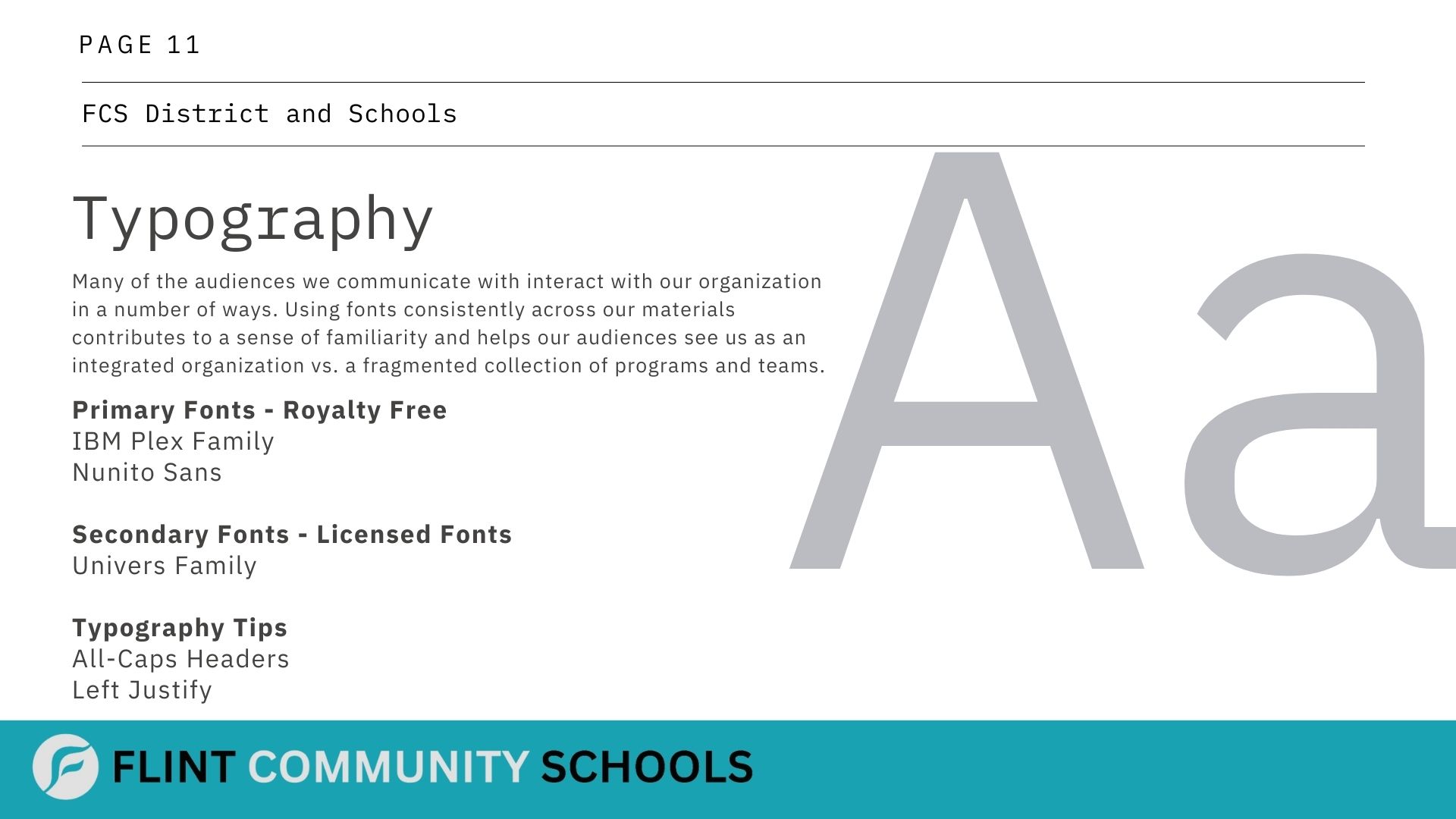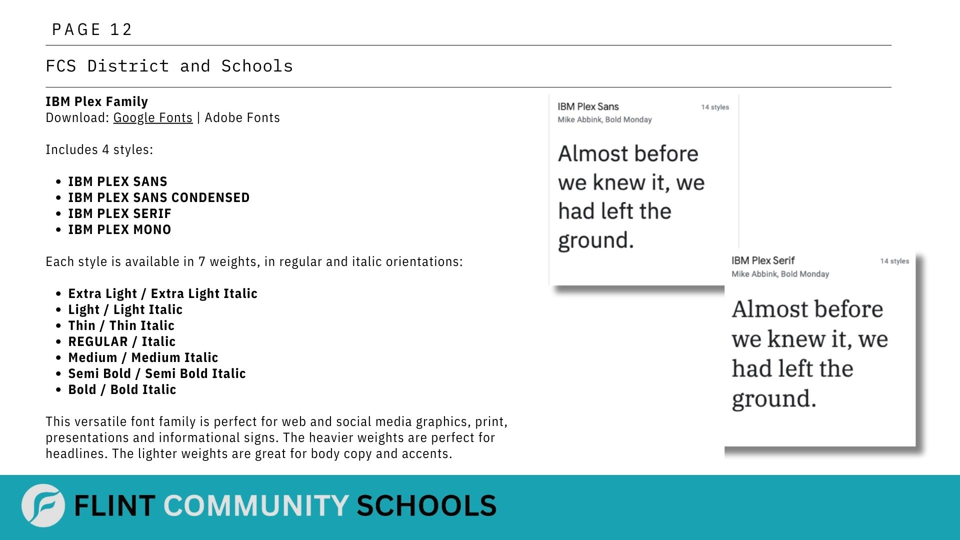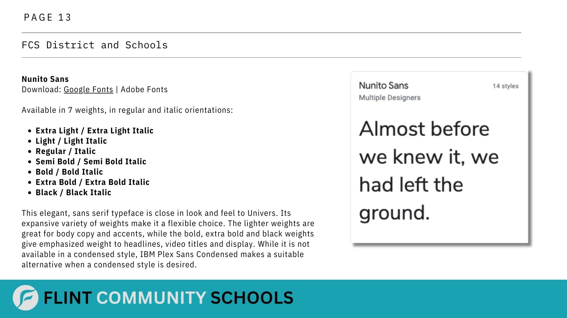
Branding Color, Tips, Logo Placement and Typography
Color Tips and Logo Placement
The Flint Community Schools' branding guidelines emphasize distinct color tips and specific logo placement strategies to create a cohesive and recognizable identity.
Color Tips:
Primary Palette: The branding utilizes a carefully selected primary color palette that embodies the school's spirit and values. These colors are used prominently in all communications to ensure consistency and brand recognition.
Secondary Palette: A complementary secondary palette provides flexibility while maintaining visual coherence across various platforms and materials.
Application: The guidelines specify how these colors should be applied in different contexts, including digital media, print materials, and physical branding.
Logo Placement:
Standard Positions: The guidelines define standard positions for logo placement, ensuring it is always prominent and recognizable.
Scaling and Size: Details on appropriate scaling and size for different applications ensure the logo remains clear and impactful across all mediums.
Variations: The guidelines also address acceptable variations in logo placement to accommodate diverse applications while maintaining brand integrity.
Overall, Flint Community Schools' branding guidelines for color usage and logo placement are designed to foster a strong, unified brand image, enhancing the school's visibility and identity in the community.
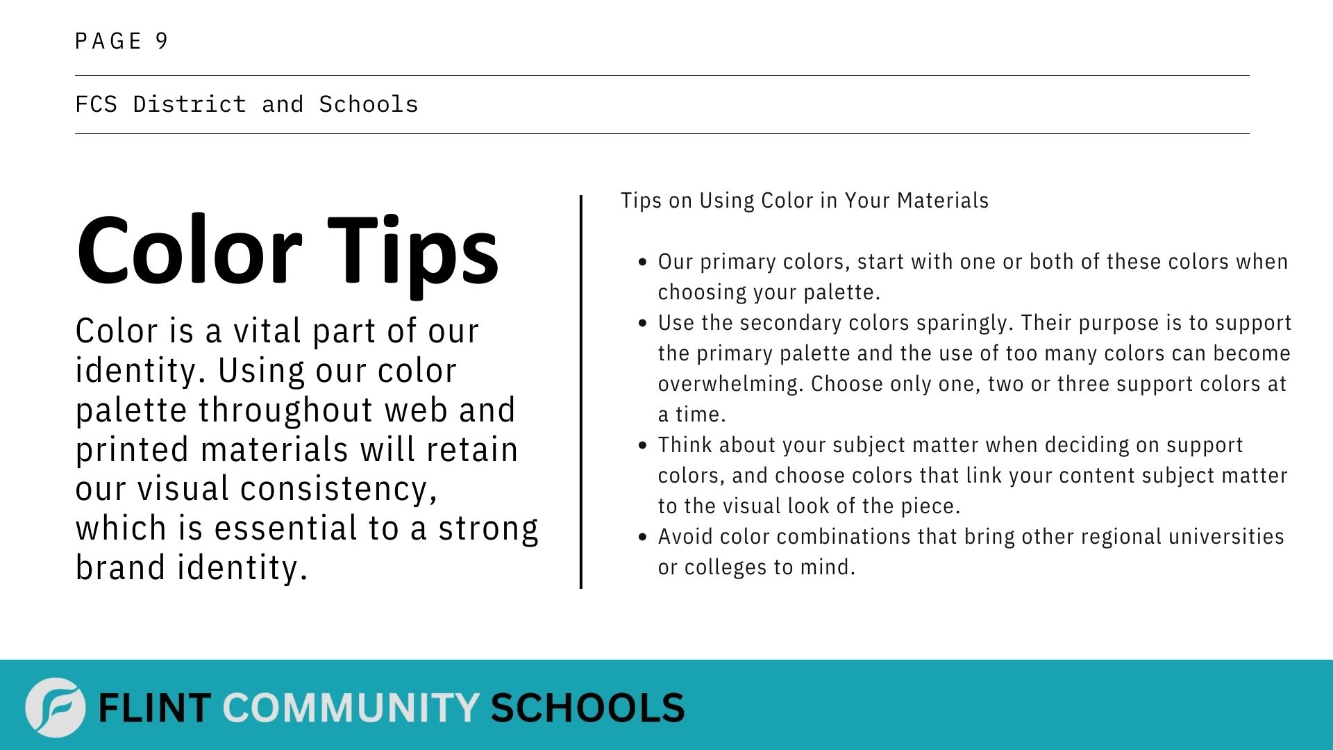
Typography Information
